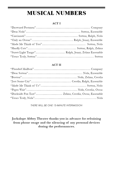
Create an alluring book cover design
Design Goal
As I researched more about the publishing industry, I decided to brainstorm a concept for a book to design a cover around. After looking at hundreds of book covers at my local bookstores and libraries, I landed on creating an adult literary novel with these hypothetical plot details and themes to reflect in this concept:
Distance creating fragmented communication
Significance tied to location (Cincinnati and an unnamed coastal city)
A deep hold or fixation within a relationship that is difficult to untether
Journey and change
Chosen Imagery
Visual execution
Now that I had a feel for the type of story I was depicting, finding the right symbols to convey the above ideas in an interesting design
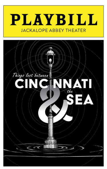
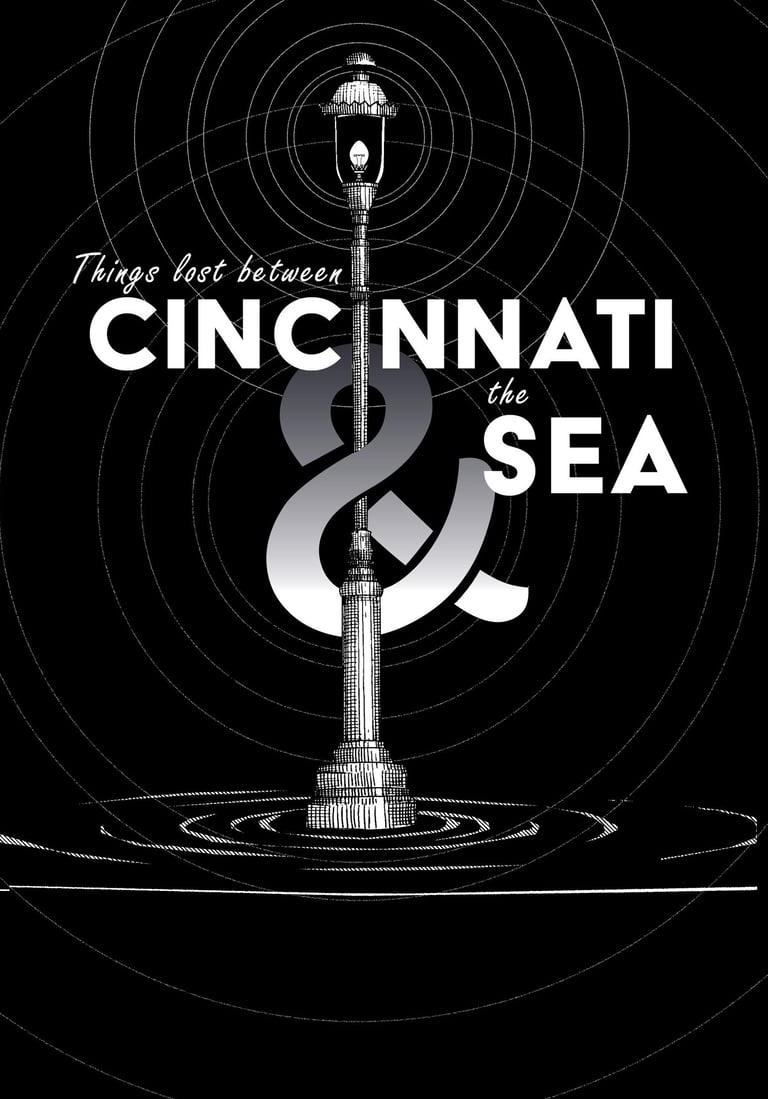
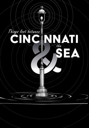
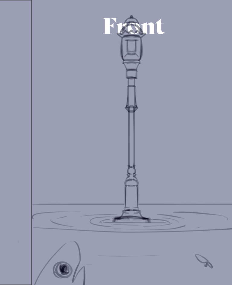
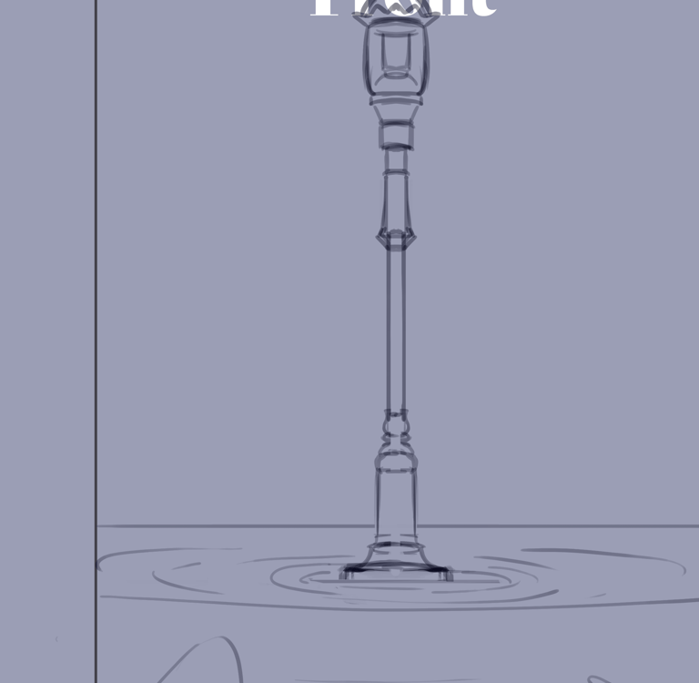
The dark, empty background both provides excellent contrast to the focal point of the street lamp and title, but also forces a limited view, akin to how when people are separated by great distances, the flow of information can easily break down, leaving only bits and pieces of the situation clear and visible.
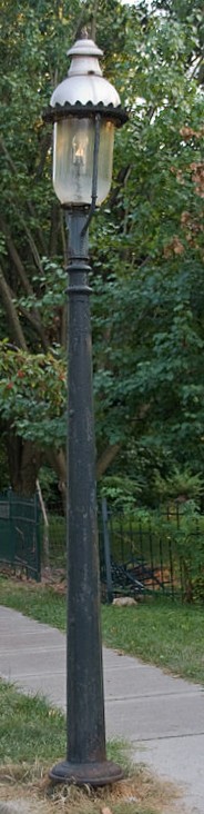
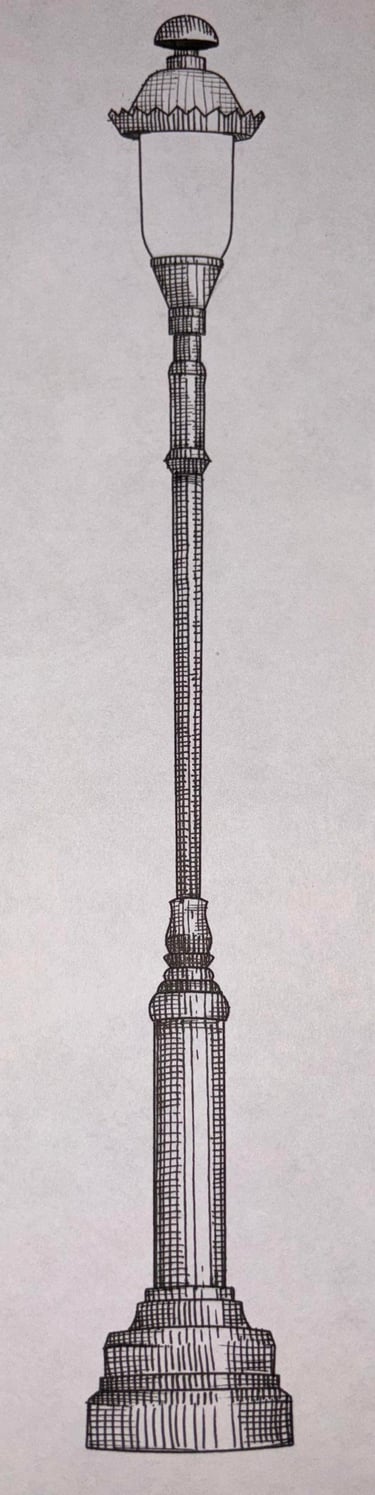
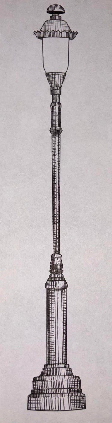
For Cincinnati, I wanted to find a city-specific object to incorporate and anchor significance. With a little research, I learned about the historic Cincinnati street gas lamps that have a distinct crown shape above the glass. Ripples that encircle the lamp allude to the sea, with a point of firm contact.
The concentric circles of the ripples are echoed in the glow coming off the light bulb. Concentric circles create a high-impact spot where our eyes linger, a visual motif of fixation.
A lamp post is a pretty direct euphemism for a guiding light sought by someone lost on a journey when all other paths are dark, also a thematic connection to the well-known symbol in Narnia, which kicks off their journey.
Sketches
Initial Sketch
Lamp process - Since the lamps were a mid-nineteenth-century addition to the city I wanted to emulate a cross hatching etching to give it a dated look

Create vector
based on photo
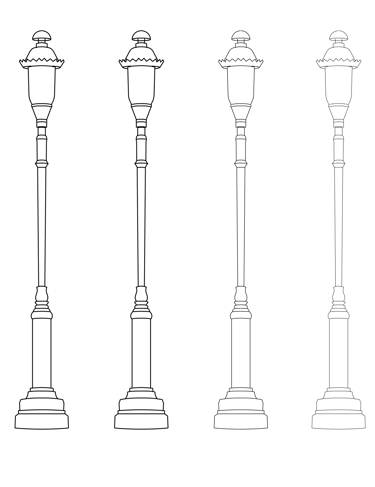
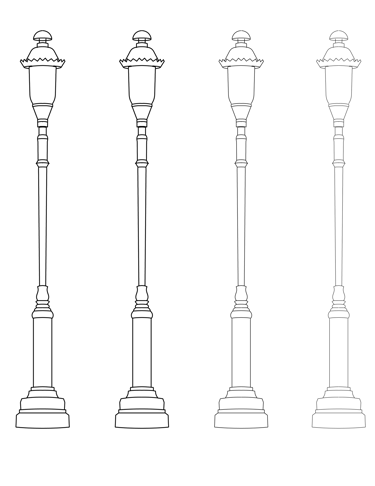
Vary line weight for style options
Use microns of differing weight till happy with result
Typography and Format Study
I took the illustration and applied it to designing the first few pages of a playbill to explore types of book layouts. This was an interesting process because, while there are some sections found in almost every playbill, there were more inconsistencies than I anticipated. Some were stylistic choices, but many were the result of needing to convey different information. For example, a playbill for a musical with a large orchestra accompaniment is going to need different sections than a Shakespearean production.